Where And Which Icons To Use On Your Website
Lets be honest – there is so much to choose from, we literally can’t wrap our mind around which icon-pack we should use. There are thousands and thousands available. Some are from trusted and well branded sources as Google or Apple, but most of them come from designers like for example us (we did not create an icon-pack).
Instead of packing your webpage full of different icons, for every possible link, action and expression, you might rather follow some guidelines. As we will always tell you: „Keep it simple“ – once again.
Icon Menu, Or Text-Menu?
While it is not a do, or don’t we would recomment mainly using menu icons on mobile devices, not for websites. Unless you have a website like Dropbox or some similar service, but not for a client like an Architect or a Painter, Engineer and so on. The reason would be, that icons in many circumstances can mislead or irritate the user. That is what we are trying to avoid – we want a clear interface / UI where the visitor knows where to click. So don’t be shy, you can gladly use text in the menu: „About us“, „Pricing“, „Back“, „Send“… whatever you please.
We also have some tips for Mobile UI over here, have a look.
How Many Icons Do I Use?
Most importantly – don’t overfill it! Rather only have a hand full of icons on the webpage. Maybee only have two in the gallery, so you can go back and forth between images.
There is an example here that we like, it currently has 3 icons. Gallery arrow icons, and a backlight changing icon. While we don’t agree on a few other aspects of the homepage, we really like that they kept it simple.
Which Icons Do I Use?
If you want to make sure, that the visitor understands the meaning of your icons:
- use icons they know
- use the icons according to their meaning
So for example use Google Material Design icons. Everyone knows the „Download“, „Refresh“, and „Settings“ buttons. We have a brief preview of them below.

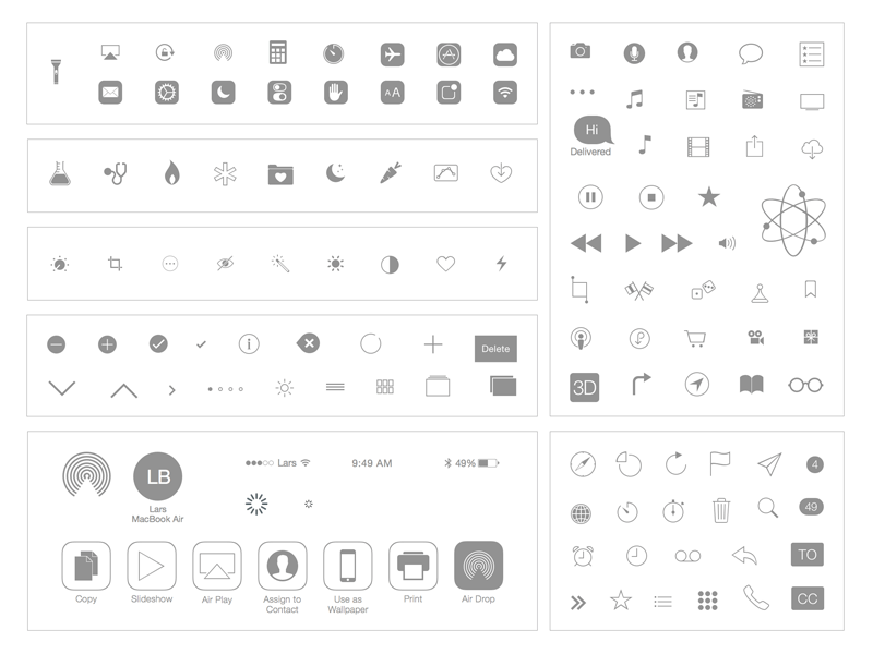
Not good enough? Go for the icons that Apple uses. One of the most known Apple-Icons in our opinion would be the „Music Player“ icon, „Copy Paste“ and „User“ icon. Also you get a quick preview below.

We hope that our rather short guide was of some help to you. If you think we are missing something essential, or would like to give us some other advice, we would be glad to hear from you! Meanwhile we hope everyone has a good time!